Entry 1
Authors
- Eric J. Ma
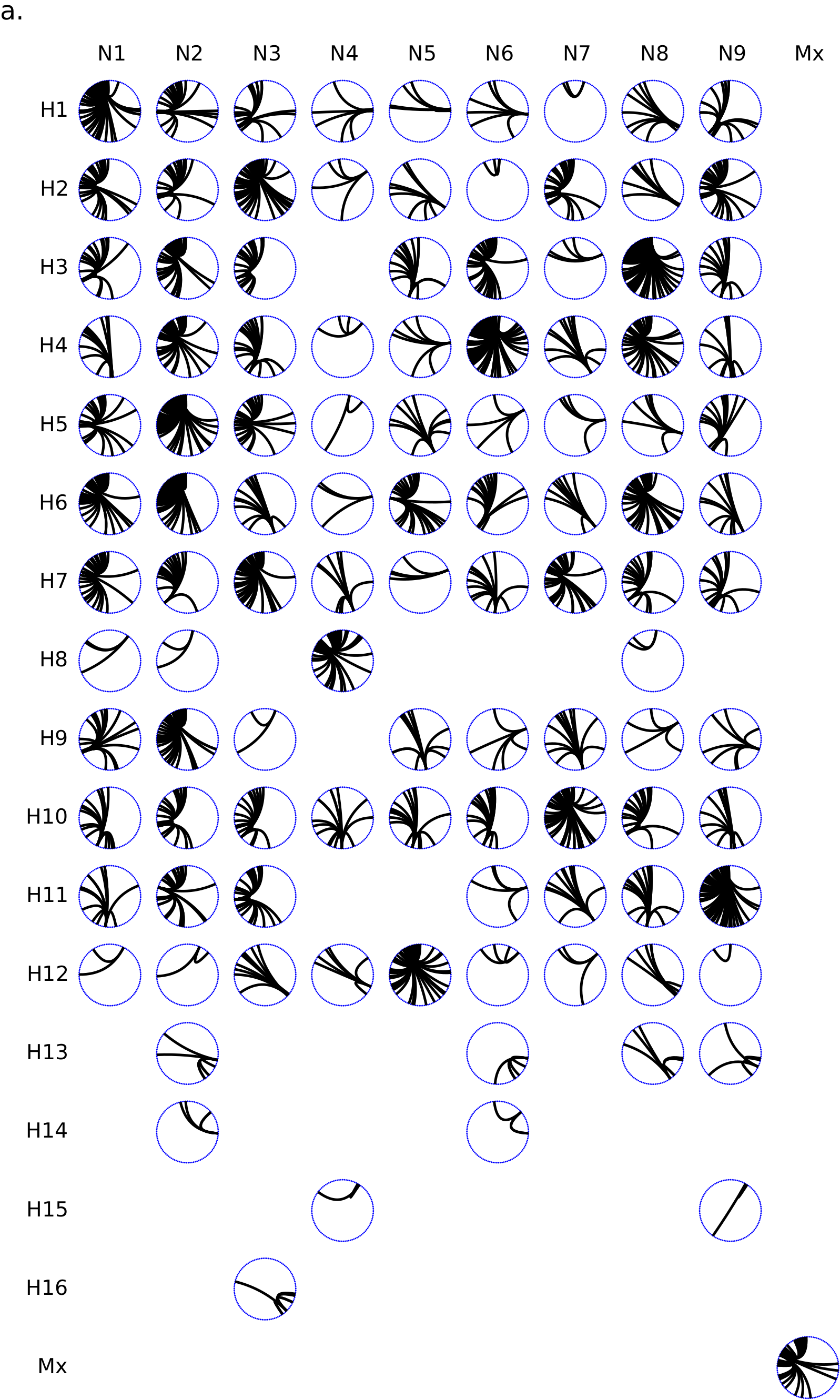
This Circos panel shows the connectivity of a given influenza HA/NA subtype combination with other influenza subtypes. Circos plots are a rational alternative to the node-link diagrams (a.k.a. “hairballs”) that are commonly used for displaying graph/network data. They were pioneered by Martin Krzywinski at the BC Genome Sciences Centre.
The influenza virus has 8 genomic segments. Each virus can be thought of as a deck of 8 cards. We commonly think about the virus as being transmitted from one host to the next, but occasionally, reassortment can happen. Reassortment is akin to having a red virus and a blue virus shuffle their cards together in one co-infected cell, producing a progeny with a mixture of red and blue cards (segments). In the Circos plot, connectivity between subtypes is defined by reassortment source-sink relationships. For example, if an H3N8 and H4N6 virus reassort to produce an H3N6 progeny, then H3N8 and H3N6, and H4N6 and H3N6, have interacted. We model this in a subtype interaction network constructed from a reassortment detection algorithm that I have developed. In my research, I have found that there are some influenza subtypes that have donated or accepted viral segments from many other subtypes, and some that have had such donor/acceptor interactions with fewer subtypes. The subtypes that have been involved in outbreaks in farm animals and humans have also historically been highly connected subtypes.
To visualize this connectivity, I have chosen to use a panel of Circos plots. Within each Circos plot in the Circos panel, each node along the circumference is a unique subtype (HxNy). Subtypes are ordered clockwise along the circumference, starting at the 12 o’clock position, in increasing connectivity. Edges are drawn using Bézier curves betweeen the nodes, pulled towards the circle center. Each plot in the panel corresponds to a unique HA/NA combination, with each row being an HA type and each column being an NA type. From this panel, it becomes easy to see that H3N8 and H4N6 have been involved in many donor/acceptor relationships, and other subtypes such as H4N4 are involved in much fewer donor/acceptor relationships. In the context of the paper we are writing, figures are colour coordinated, with blue nodes representing reassortment events and relationships. Hence each Circos plot is dotted around the circumference with blue dots. The Circos plot also highlights the influenza subtypes for which we have yet to detect a reassortment interaction, as evidenced by the absence of a Circos plot in that subtype’s HA/NA cell in the Circos panel.
Because Circos plots have not been implemented for Python, I created a plotting utility with an MIT undergraduate student in our group, Justin Zabilansky (jzab@mit.edu), included with this submission, which we will release to PyPI soon. It will be a sister package to the hiveplot package, which is already on PyPI. Both of these utilities were enabled heavily by the matplotlib package, with the drawing of edges using matplotlib’s Bézier curve capabilities.
Source
import numpy as np
import matplotlib.pyplot as plt
import matplotlib.patches as patches
import math

from matplotlib.path import Path

class CircosPlot(object):
	def __init__(self, nodes, edges, radius, nodecolor='black', figsize=(8,8), ax=None, fig=None):
		self.nodes = nodes # Dictionary of nodes
		self.edges = edges # Dictionary of Edges
		self.nodecolor = nodecolor
		self.radius = radius
		if fig == None:
			self.fig = plt.figure(figsize=figsize)
		else:
			self.fig = fig
		if ax == None:
			self.ax = self.fig.add_subplot(111)
		else:
			self.ax = ax
		self.node_radius = self.radius*0.05
		self.ax.set_xlim(-radius*1.05, radius*1.05)
		self.ax.set_ylim(-radius*1.05, radius*1.05)
		self.ax.xaxis.set_visible(False)
		self.ax.yaxis.set_visible(False)
		for k in self.ax.spines.keys():
			self.ax.spines[k].set_visible(False)


	def draw(self):
		self.add_nodes()
		self.add_edges()

	def add_nodes(self):
		r = self.radius
		node_r = self.node_radius
		for node in self.nodes:
			theta = self.node_theta(node)
			x, y = get_cartesian(r, theta)
			node_patch = patches.Ellipse((x,y), node_r, node_r, facecolor=self.nodecolor, lw=0)
			self.ax.add_patch(node_patch)


	def draw_edge(self, node1, node2):
		start_theta = self.node_theta(node1)
		end_theta = self.node_theta(node2)
		middle_theta = (start_theta + end_theta)/2.0
		delta_theta = abs(end_theta - start_theta)
		middle_r = self.radius * (1 - delta_theta / np.pi)

		# verts = [get_cartesian(self.radius, start_theta), get_cartesian(middle_theta, middle_r), get_cartesian(self.radius,end_theta)]
		verts = [get_cartesian(self.radius, start_theta), (0,0), get_cartesian(self.radius,end_theta)]
		codes = [Path.MOVETO, Path.CURVE3, Path.CURVE3]

		path = Path(verts, codes)

		patch = patches.PathPatch(path, lw=1, facecolor='none')
		self.ax.add_patch(patch)


	def node_theta(self, node):
		''' Maps node to Angle '''
		i = self.nodes.index(node)
		theta = i*2*np.pi/len(self.nodes)

		return theta

	def add_edges(self):
		for start, end in self.edges:
			self.draw_edge(start, end)


def get_cartesian(r, theta):
	x = r*np.sin(theta)
	y = r*np.cos(theta)

	return x, y