Entry 16
Authors
- Jan-Pieter Paadekooper
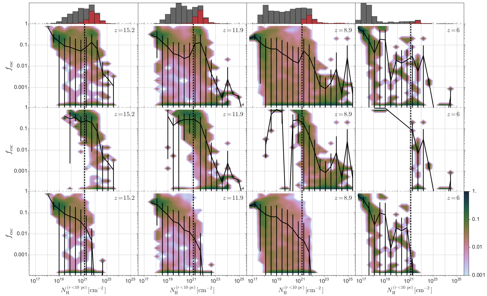
About 600 million years after the Big Bang the last major phase transition in the universe took place, in which the neutral hydrogen gas that existed between galaxies was transformed into the hot, ionized plasma it is today. The sources responsible for the ionizing photons that caused this so-called epoch of reionization are still uncertain, but more and more evidence points towards stars in galaxies. However, the contribution of galaxies depends critically on the fraction of the ionizing photons produced by the stars that make it out of the galaxies, the escape fraction. Both observations and numerical simulations have shown that escape fractions are generally very low, thus casting doubt whether galaxies can reionize the universe at all.
Our visualisation shows why it is so hard for ionizing photons to escape their host galaxies. We have performed numerical simulations of a large sample of proto-galaxies that formed during the epoch of reionization and post-processed these with detailed radiative transfer simulations to determine the escape fraction. This figure shows on the y-axis the fraction of ionizing photons produced by the stars that reach the outskirts of the galaxies. On the x-axis is the spherically averaged gas column density close to the stellar populations in the galaxy, a direct measure of the number of absorptions in the birth cloud of the stars. The solid line represents the mean in different column density bins, while the colours represent the 1D histogram in the same bin. The histogram on top shows the number of haloes in every bin, grey for all galaxies and red for galaxies with at least a stellar population that is younger than 5 million years old. Different columns depict different times in the evolution of the universe (as measured by the redshift z).
The top row of this figure shows that in all galaxies a high column density around the stars results in a low escape fraction. However, there is a sudden rise in escape fraction at intermediate column densities that can only be explained by splitting the data into two populations: galaxies hosting stellar populations that formed less than 5 million years ago (middle row) and those that do not (bottom row). Young stars produce the majority of ionizing photons over the lifetime of a stellar population. Hence, they are able to penetrate larger column densities. After 5 million years, when the ionizing photon production declines substantially, a similar column density means a smaller escape fraction.
This figure explains the circumstances under which galaxies are efficient sources of reionization: a recent burst of star formation in a low-mass proto-galaxy that does not contain enough gas to absorb all the ionizing photons that are produced. This so far over-looked population of galaxies is ubiquitous in the early universe and therefore the most likely source of reionization.
The visualisation was done with the help of the astropy package to read in and process the data and the seaborn package to customise the plots.
Source
import sys
import numpy as np
from matplotlib import pyplot
from matplotlib.ticker import ScalarFormatter, FormatStrFormatter, MaxNLocator, MultipleLocator
from matplotlib.collections import Collection
from matplotlib.artist import allow_rasterization
from matplotlib import cm
from matplotlib.colors import ListedColormap
import seaborn as sns
from astropy.table import Table
import argparse
parser = argparse.ArgumentParser( description='Plots escape fraction as function of '
'average column density around the sources '
'in panels of 4 different redshifts\n'
'with 3 rows indicating different source ages', \
formatter_class = argparse.RawTextHelpFormatter )
parser.add_argument( '--filename',
help='filename of the plot, including extension \n',
default='scipy_2015.pdf'
)
args = parser.parse_args()
##########################################################################################
'''
Empty class to be filled with the plot options
'''
class PlotOptions:
pass
options = PlotOptions()
options.redshifts = np.array([15.,12.,9.,6.]) #redshifts to plot
options.redshiftStrings = np.array([r'$z=15.2$',r'$z=11.9$',r'$z=8.9$' ,r'$z=6$' ]) #redshifts to plot
options.nBins = 20 #number of bins on x-axis for mean
options.nBinsHist = 20 #number of bins on x- and y-axis for 2d histogram
#options for the escape fraction of HI ionising photons
options.yName = 'fEscHI' #name in the data array
options.ylabel = r'$f_{\mathrm{esc}}$' #label of the y-axis
options.yRange = np.array([0.00011,1.0]) #minimum and maximum of the y-axis
options.yScale = 'log' #scale of the y-axis (linear or log)
options.yPos = np.array( [0.4, 0.4, 0.4, 0.4 ]) #position of the string with the redshift
##############################################
#options for the column density close the source
options.xName = 'nH_10' #name in the data array
options.xlabel = r'$N_{\mathrm{H}}^{(r < 10 \, \mathrm{pc})} [\mathrm{cm}^{-2}]$' #label of the x-axis
options.xRange = np.array([3.e16,4e25]) #minimum and maximum of the x-axis
options.xScale = 'log' #scale of the x-axis (linear or log)
options.xPos = np.array([4.e23,4.e23,7.e23,1.5e24]) #position of the string with the redshift
options.r_S = 10. #Stromgren radius
options.NH_r_S = 1.33e21 #column density where r_S = 10 pc for < 5 Myr old stars
##########################################################################################
# Plotting helper functions #
##########################################################################################
'''
Empty class to be filled with line styles
'''
class LineStyles:
pass
line_styles = LineStyles()
line_styles.dash_dot = [3,4,7,4]
line_styles.dot = [3,4,3,4]
line_styles.dash = [7,4,7,4]
'''
Function: set_line_style
Purpose: converts string to line style from the LineStyles class
(only in case the string matches a line style in the class)
and assigns linestyle to the line2D object
Params: line: line2D object to style
lineStyle: string containing line style
Programmer: Jan-Pieter Paardekooper
Creation: Jun 05, 2014
Last modified: Nov 05, 2014
'''
def set_line_style( line, lineStyle ):
if( lineStyle == 'dot' ):
line[0].set_dashes( line_styles.dot )
elif( lineStyle == 'dash' ):
line[0].set_dashes( line_styles.dash )
elif( lineStyle == 'dashDot' ):
line[0].set_dashes( line_styles.dash_dot )
elif( lineStyle == 'dashed' ):
line[0].set_dashes( line_styles.dash )
elif( lineStyle == 'dashedDotted' ):
line[0].set_dashes( line_styles.dash_dot )
'''
Empty class to be filled with colors
colors taken from:
http://figuredesign.blogspot.de/2012/04/meeting-recap-colors-in-figures.html
'''
class Colors:
pass
colors = Colors()
colors.darkred = 127.5/255., 0./255. , 0./255.
colors.red = 237./255. , 28./255. , 36./255.
colors.orange = 241./255. , 140./255., 34./255.
colors.yellow = 255./255. , 222./255., 23./255.
colors.lightgreen = 173./255. , 209./255., 54./255.
colors.darkgreen = 8./255. , 135./255., 67./255.
colors.lightblue = 71./255. , 195./255., 211./255.
colors.darkblue = 33./255. , 64./255. , 154./255.
colors.purple = 150./255. , 100./255., 155./255.
colors.pink = 238./255. , 132./255., 181./255.
'''
Function: convert_string_to_color
Purpose: converts string to color from the Colors class
only in case the string matches a color in the class
Params: color: string containing color
Programmer: Jan-Pieter Paardekooper
Creation: Jun 05, 2014
Last modified: Nov 05, 2014
'''
def convert_string_to_color( color ):
#use own colors in these cases
if(color == 'darkred'):
return colors.darkred
elif(color == 'red'):
return colors.red
elif(color == 'orange'):
return colors.orange
elif(color == 'yellow'):
return colors.yellow
elif(color=='green'):
return colors.darkgreen
elif(color == 'lightgreen'):
return colors.lightgreen
elif(color == 'darkgreen'):
return colors.darkgreen
elif(color == 'blue'):
return colors.darkblue
elif(color == 'lightblue'):
return colors.lightblue
elif(color == 'darkblue'):
return colors.darkblue
elif(color=='purple'):
return colors.purple
elif(color=='pink'):
return colors.pink
return color
##########################################################################################
'''
Function: plot_line
Purpose: plots the data as line
Params: ax : axis object
data : 2d array containing x- and y-values
color : string with color name to plot
linewidth : line width of the line
linestyle : string with line style
label : label of the plot
alpha : alpha parameter of line
zorder : zorder parameter of the line
Programmer: Jan-Pieter Paardekooper
Creation: Jun 04, 2014
Last modified: Dec 03, 2014
'''
def plot_line(ax,data,color='black',linewidth=3,linestyle='',label='', alpha=1, zorder=2):
color = convert_string_to_color( color )
line = ax.plot( data[0], data[1], color=color, linewidth=linewidth, zorder=zorder, label=label, alpha=alpha)
set_line_style( line, linestyle )
'''
Function: plot_error_bar
Purpose: plots the error bars on the data
Params: ax : axis object
data : 2d array containing x- and y-values
color : string with color name to plot
label : label of the plot
doShading : if True, plot error as shading instead
of error bars
zorder : zorder of the plot
linestyle : linestyle of the line
Programmer: Jan-Pieter Paardekooper
Creation: Jun 05, 2014
Last modified: Mar 04, 2015
'''
def plot_error_bar(ax,data,yRange,color='black',label='',doShading=False, zorder=2, linestyle=''):
color = convert_string_to_color( color )
#prevent y-errors below minimum:
ylower = np.maximum(yRange[0], data[1] - data[2])
yerr_lower = data[1] - ylower
#prevent y-errors above maximum
yupper = np.minimum(yRange[1], data[1] + data[2])
yerr_upper = yupper - data[1]
if( doShading ):
ax.fill_between(data[0], ylower, yupper, facecolor=color, interpolate=False, alpha=0.7, edgecolor='none',zorder=zorder)
else:
#zorder higher than line makes sure the errorbars are visible on top of the points
line = ax.errorbar(data[0],data[1],yerr=[yerr_lower,yerr_upper], color=color, ecolor=color, elinewidth=3,zorder=zorder,linestyle="None")
##########################################################################################
'''
Function: compute_bins
Purpose: returns the bin edges and bin values given a number
of bins and the range of the data, either linearly
or logarithmically spaced
Params: nBins : number of bins
dataRange: minimum and maximum bin
doLog : if True, logaritmically spaced bins are returned
Programmer: Jan-Pieter Paardekooper
Creation: Jun 05, 2014
Last modified: Jun 05, 2014
'''
def compute_bins(nBins, dataRange, doLog=False):
if( doLog ):
dataRange = np.log10(dataRange)
#size of the bins
binSize = (dataRange[1] - dataRange[0])/float(nBins)
#edges of the bins
binEdges = np.zeros( nBins + 1 )
for i in range(0,nBins+1):
binEdges[i] = dataRange[0] + i*binSize
if( doLog ):
binEdges = 10**binEdges
#central values of the bins
binValues = np.zeros( nBins )
for i in range(0,nBins):
if(doLog):
binValues[i] = 10**( 0.5 * (np.log10( binEdges[i] ) +\
np.log10( binEdges[i+1] ) ) )
else:
binValues[i] = 0.5 * ( binEdges[i] + binEdges[i+1] )
return binEdges, binValues
'''
Function: compute_mean
Purpose: computes the mean of the data in bins and the error bar (stdv)
Params: data : 2d array containing x- and y-values
xRange : range of x-axis
nBins : number of bins on x-axis
logData : True if quantity is plotted in log
Programmer: Jan-Pieter Paardekooper
Creation: Jun 05, 2014
Last modified: Jun 05, 2014
'''
def compute_mean( data, xRange, nBins=10, logData=np.array([False,False]) ):
#compute the bins on the x-axis
binEdges, xValues = compute_bins(nBins,xRange,logData[0])
#indices of the x-data in every bin
indices = np.digitize( data[0], binEdges )
yValues = np.zeros( nBins )
yStd = np.zeros( nBins )
for i in range(0,nBins):
#get indices of this bin
currentIndex = np.where(indices == i+1)[0]
#y-values in current bin
yBinned = data[1][currentIndex]
#get mean if there are values
if(np.size(yBinned) > 0):
yValues[i] = np.mean(yBinned)
yStd[i] = np.std(yBinned)
return xValues, yValues, yStd
'''
Function: plot_mean
Purpose: plots the mean of the data in bins and the error bar (stdv)
Params: ax : axis object
data : 2d array containing x- and y-values
xRange : range of x-axis
yRange : range of y-axis
nBins : number of bins on x-axis
logData : True if quantity is plotted in log
linestyle : line style of the line
color : color of the line
label : label of the line
do_plot_error_bars: if True plot error bars
zorder : zorder of the line
Programmer: Jan-Pieter Paardekooper
Creation: Jun 04, 2014
Last modified: Dec 03, 2014
'''
def plot_mean(ax, data, xRange, yRange, nBins, logData=np.array([False,False]),\
linestyle='',color='black',label='',do_plot_error_bars=True,zorder=2 ):
xValues, yValues, yStd = compute_mean( data, xRange, nBins, logData )
#only plot where the mean is bigger than zero, i.e. where we have data
mask = yValues > 0.
plotData = np.array([ xValues[mask], yValues[mask], yStd[mask] ])
plot_line(ax,plotData,linestyle=linestyle,color=color,label=label,zorder=zorder)
if(do_plot_error_bars):
plot_error_bar(ax,plotData,yRange,color=color,zorder=zorder)
##########################################################################################
'''
Function: plot_histogram_1d
Purpose: plots the 1d histogram of data
Params: ax : axis object
data : 1d numpy array with data to plot
dataRange: 2d numpy array with minimum and maximum of the data
nBins : number of bins of the data
color : string with color
doPlotLog: plot data in log-scale
normed : if True, normalise, otherwise true counts are displayed
alpha : alpha parameter of plot
Programmer: Jan-Pieter Paardekooper
Creation: Jun 09, 2014
Last modified: Sep 05, 2014
'''
def plot_histogram_1d(ax,data,dataRange,nBins=10,color='black',doPlotLog=False,normed=False,alpha=1.0):
if( doPlotLog ):
data = np.log10(data)
dataRange = np.log10(dataRange)
color = convert_string_to_color(color)
n, bins, patches = ax.hist(data, nBins, range=(dataRange[0],dataRange[1]), \
normed=normed, facecolor=color, alpha=alpha)
##########################################################################################
'''
Class to list the collections of the plot and return
the ones that can be rasterized
This is necessary since contourf does not support rasterization
See: http://stackoverflow.com/questions/12583970/matplotlib-contour-plots-as-postscript
Creation: Jun 23, 2014
Last modified: Jun 23, 2014
'''
class ListCollection(Collection):
def __init__(self, collections, **kwargs):
Collection.__init__(self, **kwargs)
self.set_collections(collections)
def set_collections(self, collections):
self._collections = collections
def get_collections(self):
return self._collections
@allow_rasterization
def draw(self, renderer):
for _c in self._collections:
_c.draw(renderer)
'''
Function: rasterise_contour_plot
Purpose: rasterises the contour plot by removing all PathCollection
instances and inserting the new rasterised collection
Source:
http://sourceforge.net/p/matplotlib/mailman/message/27941302/
Params: c: contour
Programmer: Jan-Pieter Paardekooper
Creation: Jun 23, 2014
Last modified: Jun 23, 2014
'''
def rasterise_contour_plot(c):
#the collections to rasterise
collections = c.collections
for _c in collections:
_c.remove()
cc = ListCollection(collections, rasterized=True)
ax = pyplot.gca()
ax.add_artist(cc)
return cc
'''
Function: compute_hist_2d_constrained
Purpose: returns the x-values in bins, the y-values in bins and
the constrained 2d histogram
Params: data : 2d array containing x- and y-values
xRange : range of x-axis
yRange : range of y-axis
nBins : number of bins in each direction
logData : np array of size 3:
(x,y,histogram values)
True if quantity is plotted in log
Programmer: Jan-Pieter Paardekooper
Creation: Jun 06, 2014
Last modified: Jun 06, 2014
'''
def compute_hist_2d_contrained(data,xRange,yRange,nBins=10,logData=np.array([False,False,False])):
#compute the bins on the x-axis and y-axis
xBins, xInBins = compute_bins(nBins, xRange, logData[0])
yBins, yInBins = compute_bins(nBins, yRange, logData[1])
#indices of the haloes in every bin
indices = np.digitize( data[0], xBins )
hist2d = np.zeros([nBins,nBins])
#compute the histogram in every bin
for i in range(0,nBins):
#get current index
currentIndex = np.where(indices == i+1)[0]
#y-values in current bin
yBinned = data[1][currentIndex].copy()
if(np.size(yBinned) > 0):
hist, bin_edges = np.histogram(yBinned,density=False,bins=yBins)
#normalise
hist_norm = np.cast['float'](hist) / np.cast['float'](np.size(yBinned))
hist2d[i] = hist_norm
return xInBins, yInBins, hist2d
'''
Function: plot_hist_2d
Purpose: plots the 2d (constrained) histogram
Params: ax : axis object
data : 2d array containing x- and y-values
xRange : range of x-axis
yRange : range of y-axis
nBins : number of bins in each direction
logData : np array of size 3:
(x,y,histogram values)
True if quantity is plotted in log
levelRange : range of levels to plot
Programmer: Jan-Pieter Paardekooper
Creation: Jun 04, 2014
Last modified: Sep 05, 2014
'''
def plot_hist_2d( ax, data, xRange, yRange, nBins=10, \
logData=np.array([False,False,False]), \
levelRange=np.array([1.e-3,1.]) ):
xValues, yValues, hist2d = compute_hist_2d_contrained(data,xRange,yRange,nBins,logData)
if( logData[0] == True):
xValues = np.log10(xValues)
if( logData[1] == True ):
yValues = np.log10(yValues)
X, Y = np.meshgrid(xValues, yValues)
#levels to plot, logarithmic or linear
if( logData[2] == True ):
levels = np.linspace( np.log10(levelRange[0]),np.log10(levelRange[1]),100)
zeroLevel = np.log10(levelRange[0]) - 1.
#take the log of the non-zero values and
#set the zero values outside the plotting range
tmpHist = np.ma.log10(hist2d)
tmpHist = tmpHist.filled( zeroLevel )
hist2d = tmpHist
else:
levels = np.linspace(levelRange[0],levelRange[1],100)
zeroLevel = levelRange[0] - 1.
#make sure to plot the maximum values
mask = hist2d > levelRange[1]
hist2d[mask] = levelRange[1]
color_map = sns.cubehelix_palette(start=0.5,rot=-1.5, as_cmap=True)
#color_map = 'cubehelix'
CS = ax.contourf(X, Y, hist2d.T, levels=levels, zorder=1, cmap=color_map)
rasterise_contour_plot(CS)
return CS
##########################################################################################
# Generating the figure #
##########################################################################################
'''
Function: set_plot_properties
Purpose: set the properties of the plots (axis range, labels etc)
Params: ax : axis object of the plot
plotIndex: index of the plot
0: empty axes but scaling as plotIndex 1
1: all properties are set for this plot
2: empty axes
colIndex : column index of the subplot
rowIndex : row index of the subplot
Programmer: Jan-Pieter Paardekooper
Creation: Jul 14, 2014
Last modified: Sep 10, 2014
'''
def set_plot_properties( ax, plotIndex, colIndex=0, rowIndex=0 ):
if( plotIndex == 0 ):
#set limit on axes
if( options.yScale == 'log'):
ax.set_ylim([np.log10(options.yRange[0]),np.log10(options.yRange[1])])
else:
ax.set_ylim([options.yRange[0],options.yRange[1]])
if( options.xScale == 'log'):
ax.set_xlim([np.log10(options.xRange[0]),np.log10(options.xRange[1])])
else:
ax.set_xlim([options.xRange[0],options.xRange[1]])
#hide all ticks and labels
ax.get_xaxis().set_visible(False)
ax.get_yaxis().set_visible(False)
pyplot.setp(ax.get_yticklabels(), visible=False)
pyplot.setp(ax.get_xticklabels(), visible=False)
elif( plotIndex == 1):
#set axis scale
ax.set_yscale(options.yScale)
ax.set_xscale(options.xScale)
#set limit on yscale
ax.set_ylim([options.yRange[0],options.yRange[1]])
#set limit on x-scale
ax.set_xlim([options.xRange[0],options.xRange[1]])
#set the y-label and the string with the redshift
if ( colIndex == 0 ):
ax.set_ylabel(options.ylabel, fontsize=30, family='serif')
else:
pyplot.setp(ax.get_yticklabels(), visible=False)
#set the x-label
if( rowIndex == 2 ):
ax.set_xlabel(options.xlabel, fontsize=26, family='serif')
else:
pyplot.setp(ax.get_xticklabels(), visible=False)
#make the numbers on the axes bigger
ax.tick_params(axis='x', labelsize=22)
ax.tick_params(axis='y', labelsize=22)
#makes the y-axis ticks look nice, like 0.01 0.1 1.0
formatter = FormatStrFormatter('%g')
ax.yaxis.set_major_formatter( formatter )
if( options.yScale == 'linear' ):
minorLocator = MultipleLocator(0.1)
ax.yaxis.set_minor_locator(minorLocator)
#make the labels on the x-axis less cluttered
i = 0
for label in ax.get_xticklabels():
if((i+1)%2 == 0):
label.set_visible(False)
i+=1
#plot the string with the redshifts
pyplot.text(options.xPos[colIndex], options.yPos[colIndex], options.redshiftStrings[colIndex], fontsize=26)
elif( plotIndex == 2 ):
if( options.xScale == 'log'):
ax.set_xlim([np.log10(options.xRange[0]),np.log10(options.xRange[1])])
else:
ax.set_xlim([options.xRange[0],options.xRange[1]])
#hide all ticks and labels
ax.get_xaxis().set_visible(False)
ax.get_yaxis().set_visible(False)
pyplot.setp(ax.get_yticklabels(), visible=False)
pyplot.setp(ax.get_xticklabels(), visible=False)
'''
Function: plot_fEsc_NH
Purpose: plot escape fraction as function of column density
within 10 pc of the sources
Programmer: Jan-Pieter Paardekooper
Creation: Jul 11, 2014
Last modified: Apr 13, 2015
'''
def plot_fEsc_NH():
sns.set_style("ticks",{'axes.grid': True})
#determine if we are plotting in log: x,y,and z
logData = np.array([False,False,False])
if( options.xScale == 'log' ):
logData[0] = True
if( options.yScale == 'log' ):
logData[1] = True
#always plot the log of the data
logData[2] = True
#array containing the column density at which the Stromgren sphere
# is 10 pc
r_S_data = np.array([[options.NH_r_S, options.NH_r_S],options.yRange] )
#create figure with right size
fig = pyplot.figure(figsize=(28,17),dpi=300)
#margins
left_margin = 0.06
bottom_margin = 0.07
right_margin = 0.047
top_margin = 0.01
#main plot window position
main_left = left_margin
main_bottom = bottom_margin
main_width = 0.25*(1.-left_margin-right_margin)
main_heigth = (1.-bottom_margin-top_margin)/(3.25)
#histogram position
hist_left = main_left
hist_bottom = main_bottom+3*main_heigth
hist_width = main_width
hist_heigth = 0.25*main_heigth
NH_min = np.array([1.e32,1.e32,1.e32])
NH_max = np.array([0.0,0.0,0.0])
#loop over redshift bins
for i in range(0,4):
data = Table.read('data_00'+str(i)+'.dat',format='ascii')
#some haloes may not have data
mask = data[options.xName] > -1
data = data[mask]
plotData = np.array([ data[options.xName], data[options.yName] ])
mask_active = data['ageStarMin'] <= 5.
mask_passive = data['ageStarMin'] > 5.
plotData_active = np.array([ data[options.xName][mask_active], data[options.yName][mask_active] ])
plotData_passive = np.array([ data[options.xName][mask_passive], data[options.yName][mask_passive] ])
NH_min[0] = np.amin( np.array([ NH_min[0], np.amin(plotData[0]) ]) )
NH_max[0] = np.amax( np.array([ NH_max[0], np.amax(plotData[0]) ]) )
NH_min[1] = np.amin( np.array([ NH_min[1], np.amin(plotData_active[0]) ]) )
NH_max[1] = np.amax( np.array([ NH_max[1], np.amax(plotData_active[0]) ]) )
NH_min[2] = np.amin( np.array([ NH_min[2], np.amin(plotData_passive[0]) ]) )
NH_max[2] = np.amax( np.array([ NH_max[2], np.amax(plotData_passive[0]) ]) )
################################################################################
ax2 = pyplot.axes((hist_left+i*hist_width, hist_bottom, hist_width, hist_heigth))
ax0 = pyplot.axes((main_left+i*main_width, main_bottom+2*main_heigth, main_width, main_heigth))
ax1 = pyplot.axes((main_left+i*main_width, main_bottom+2*main_heigth, main_width, main_heigth),frameon=False)
plot_mean(ax1,plotData,options.xRange,options.yRange,options.nBins,logData)
#This is only for the histogram
mask_zero_y = plotData[1] < options.yRange[0]
plotData[1][mask_zero_y] = options.yRange[0]
#levelRange = np.array([1.e-9,1.e-5])
levelRange = np.array([1.e-3,1.])
CS = plot_hist_2d( ax0, plotData, options.xRange, options.yRange, \
options.nBinsHist, logData, levelRange )
#plot the Stromgren sphere
plot_line(ax1,r_S_data, linestyle='dash', linewidth=4)
#set plot properties
set_plot_properties(ax0,0)
set_plot_properties(ax1,1,i,0)
################################################################################
ax0 = pyplot.axes((main_left+i*main_width, main_bottom+main_heigth, main_width, main_heigth))
ax1 = pyplot.axes((main_left+i*main_width, main_bottom+main_heigth, main_width, main_heigth),frameon=False)
plot_mean(ax1,plotData_active,options.xRange,options.yRange,options.nBins,logData)
#This is only for the histogram
mask_zero_y = plotData_active[1] < options.yRange[0]
plotData_active[1][mask_zero_y] = options.yRange[0]
levelRange = np.array([1.e-3,1.])
plot_hist_2d( ax0, plotData_active, options.xRange, options.yRange, \
options.nBinsHist, logData, levelRange)
#plot the Stromgren sphere
plot_line(ax1,r_S_data, linestyle='dash', linewidth=4)
set_plot_properties(ax0,0)
set_plot_properties(ax1,1,i,1)
################################################################################
ax0 = pyplot.axes((main_left+i*main_width, main_bottom, main_width, main_heigth))
ax1 = pyplot.axes((main_left+i*main_width, main_bottom, main_width, main_heigth),frameon=False)
#plot.plot_points( ax1, plotData )
plot_mean(ax1,plotData_passive,options.xRange,options.yRange,options.nBins,logData)
#This is only for the histogram
mask_zero_y = plotData_passive[1] < options.yRange[0]
plotData_passive[1][mask_zero_y] = options.yRange[0]
#levelRange = np.array([1.e-9,1.e-5])
levelRange = np.array([1.e-3,1.])
plot_hist_2d( ax0, plotData_passive, options.xRange, options.yRange, \
options.nBinsHist, logData, levelRange )
#plot the Stromgren sphere
plot_line(ax1,r_S_data, linestyle='dash', linewidth=4)
#set plot properties
set_plot_properties(ax0,0)
set_plot_properties(ax1,1,i,2)
#plot the color bar
if( i==3 ):
#left, bottom, width height
cbaxes = fig.add_axes([main_left+(i+1)*main_width, main_bottom, 0.01, main_heigth])
cb = pyplot.colorbar(CS, cax = cbaxes, orientation='vertical', \
ticks=[-3,-2,-1,0] )
cb.ax.set_yticklabels(['0.001', '0.01', '0.1', '1.'])
cb.ax.tick_params(labelsize=22)
#get rid of the white lines in the color bar
cb.solids.set_rasterized(True)
################################################################################
plot_histogram_1d(ax2,plotData[0],options.xRange,options.nBins,doPlotLog=True,normed=False,alpha=0.6)
plot_histogram_1d(ax2,plotData_active[0],options.xRange,options.nBins,color='red',doPlotLog=True,normed=False,alpha=0.6)
set_plot_properties(ax2,2)
################################################################################
fig.savefig(args.filename,rasterized=True)
pyplot.close(fig)
if __name__=='__main__':
plot_fEsc_NH()