Entry 5
Authors
- Caitlin Rivers
Abstract
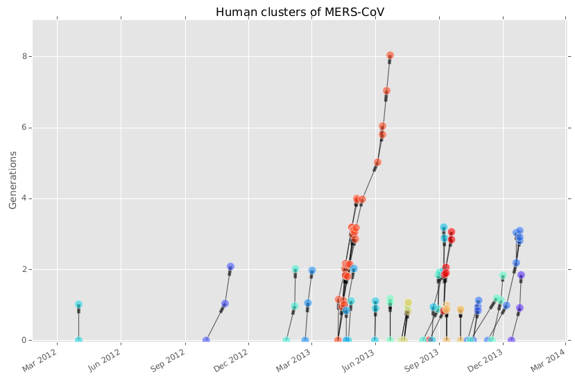
I developed case tree plots as a way to visualize emerging zoonotic disease. The x-axis is time of illness onset or diagnosis, and the y-axis is generation. Nodes at generation 0 are index nodes; in the case of a zoonosis, the index node is a human case acquired from an animal source. If that human were to pass the disease to two other humans, those two subsequent cases would both be plotted at generation 1. The meaning of the color of the node varies based on the node attribute. In this case, color signifies membership to a particular human to human cluster. However, it could also represent health status (e.g. alive, dead), the sex of the patient, etc.
The data depicted here are cases of Middle East Respiratory Syndrome Coronavirus (MERS-CoV), which is a new SARS-like virus that emerged in Saudi Arabia in 2012. MERS-CoV is thought to be acquired from camels, but human to human transmission is also possible. To build the plot, I collected case reports from the World Health Organization and various Ministries of Health. Where possible, I noted when cases were part of a human to human cluster - i.e. they acquired the disease from a human rather than an animal. The case tree plot code then estimates who transmitted the disease to whom based on the dates each person fell sick.
The result is a plot that allows for easy estimation of epidemiological parameters like basic reproduction number. Case tree plots with a lot of branches are more transmissible, and are therefore more likely to become epidemics. The plot can also indicate the frequency of introductory events, for example the number of times the disease has crossed from animals to humans. This is important for identifying the animal reservoir - frequent spillover events suggests a domesticated or agricultural animal.
The source code for this plot was released in the open-source package epipy in February of 2014. The code is available on github and the documentation is available here. The documentation includes an annotated example for producing this plot.
To download the epipy package, which includes the data shown here, call: pip install epipy